So, you’re diving into affiliate marketing, and everyone keeps talking about “landing pages” or “pre-landers.” What are they? Simply put, they’re single web pages designed to capture a visitor’s attention and guide them towards a specific action (like clicking your affiliate link).
You might think you need complex tools or coding skills, but that’s not true! You can build a perfectly functional and good-looking landing page using just HTML (the structure) and CSS (the styling) in about an hour. No fancy frameworks, no JavaScript, just the basics.
This guide will walk you through creating a simple, clean landing page. We’ll even use a hypothetical “umbrella” product as an example, just like the one I might promote!
What You’ll Need:
- A Text Editor: Notepad (Windows), TextEdit (Mac), or a more advanced editor like VS Code (recommended, free).
- A Web Browser: Chrome, Firefox, Safari – anything to view your page.
- Basic HTML/CSS Understanding (Optional): We’ll explain everything, but a little familiarity helps.
Step 1: The Basic HTML Structure (index.html)
First, let’s create the backbone of our page. Open your text editor and save a new file as index.html. Copy and paste the following code:
HTML
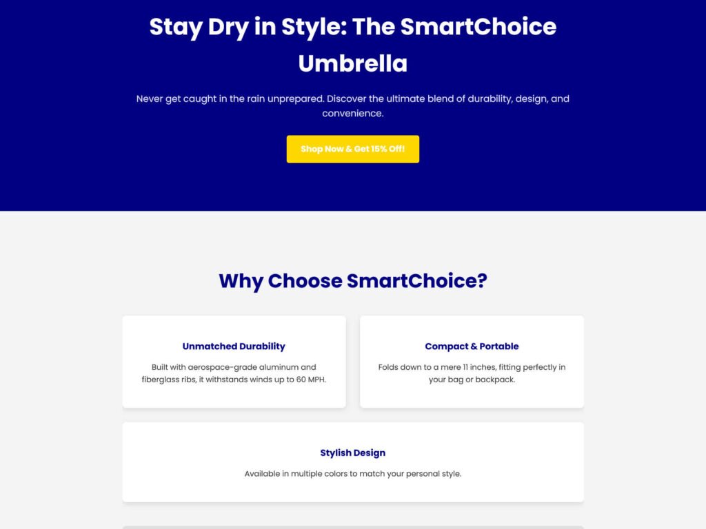
<!DOCTYPE html>
<html lang="en">
<head>
<meta charset="UTF-8">
<meta name="viewport" content="width=device-width, initial-scale=1.0">
<title>Discover the Ultimate Umbrella - Review Space</title>
<link rel="stylesheet" href="style.css">
<link href="https://fonts.googleapis.com/css2?family=Poppins:wght@400;700&display=swap" rel="stylesheet">
</head>
<body>
<header class="hero-section">
<div class="container">
<h1>Stay Dry in Style: The SmartChoice Umbrella</h1>
<p class="lead">Never get caught in the rain unprepared. Discover the ultimate blend of durability, design, and convenience.</p>
<a href="#" class="btn btn-primary btn-lg">Shop Now & Get 15% Off!</a>
</div>
</header>
<section class="features-section">
<div class="container">
<h2>Why Choose SmartChoice?</h2>
<div class="feature-grid">
<div class="feature-item">
<h3>Unmatched Durability</h3>
<p>Built with aerospace-grade aluminum and fiberglass ribs, it withstands winds up to 60 MPH.</p>
</div>
<div class="feature-item">
<h3>Compact & Portable</h3>
<p>Folds down to a mere 11 inches, fitting perfectly in your bag or backpack.</p>
</div>
<div class="feature-item">
<h3>Stylish Design</h3>
<p>Available in multiple colors to match your personal style.</p>
</div>
</div>
<div class="cta-bottom">
<p>Don't let rain ruin your day!</p>
<a href="#" class="btn btn-secondary btn-lg">See All Features & Reviews</a>
</div>
</div>
</section>
<footer>
<div class="container">
<p>© 2025 Review Space. All rights reserved.</p>
</div>
</footer>
</body>
</html>
Explanation of the HTML:
- <!DOCTYPE html>, <html>, <head>, <body>: Standard HTML boilerplate.
- <meta charset=”UTF-8″>: Ensures proper character display.
- <meta name=”viewport”…>: Makes the page responsive on mobile devices.
- <title>…</title>: The text that appears in the browser tab.
- <link rel=”stylesheet” href=”style.css”>: Links our HTML to our CSS file (which we’ll create next).
- Google Fonts: Imports the “Poppins” font for a modern look.
- <header class=”hero-section”>: The top, prominent section with a main heading and call to action.
- <section class=”features-section”>: A section to highlight product benefits.
- <footer>: The bottom part of the page with copyright info.
- <div class=”container”>: A common pattern to center content and give it a maximum width.
- <h1>, <h2>, <h3>: Headings of different sizes.
- <p>: Paragraphs of text.
- <a>: An anchor tag, used for links (our call-to-action buttons!).
- class=”…”: These are identifiers for our CSS to target specific elements.
Step 2: The CSS Styling (style.css)
Now, let’s make it look good! Create a new file in the same folder as index.html and save it as style.css. Copy and paste this code:
CSS
/* General Styling */
body {
    font-family: 'Poppins', sans-serif;
    line-height: 1.6;
    margin: 0;
    padding: 0;
    background-color: #f4f4f4; /* Light grey background */
    color: #333; /* Dark grey text */
}

.container {
    width: 90%;
    max-width: 960px; /* Max width for content */
    margin: auto; /* Center the container */
    overflow: hidden; /* Clear floats */
    padding: 20px 0;
}

/* Header Section */
.hero-section {
    background-color: #000080; /* Deep blue background */
    color: #fff; /* White text */
    padding: 80px 0;
    text-align: center;
}

.hero-section h1 {
    font-size: 3em;
    margin-bottom: 10px;
    font-weight: 700; /* Bold */
}

.hero-section .lead {
    font-size: 1.2em;
    margin-bottom: 30px;
    opacity: 0.9;
}

/* Buttons */
.btn {
    display: inline-block; /* Allows padding, margin, width */
    color: #fff;
    text-decoration: none; /* Remove underline */
    padding: 12px 25px;
    border-radius: 5px;
    transition: background-color 0.3s ease; /* Smooth hover effect */
    font-weight: 700;
}

.btn-primary {
    background-color: #FFD700; /* Golden yellow */
}

.btn-primary:hover {
    background-color: #e0bb00; /* Darker yellow on hover */
}

.btn-secondary {
    background-color: #32CD32; /* Lime green */
}

.btn-secondary:hover {
    background-color: #28a745; /* Darker green on hover */
}

.btn-lg {
    font-size: 1.1em;
    padding: 15px 30px;
}

/* Features Section */
.features-section {
    padding: 60px 0;
    text-align: center;
}

.features-section h2 {
    font-size: 2.5em;
    margin-bottom: 40px;
    color: #000080; /* Deep blue heading */
}

.feature-grid {
    display: flex; /* Flexbox for responsive layout */
    flex-wrap: wrap; /* Allows items to wrap on smaller screens */
    gap: 30px; /* Space between items */
    justify-content: center;
    margin-bottom: 50px;
}

.feature-item {
    flex: 1; /* Allows items to grow/shrink */
    min-width: 280px; /* Minimum width before wrapping */
    background-color: #fff;
    padding: 30px;
    border-radius: 8px;
    box-shadow: 0 4px 10px rgba(0, 0, 0, 0.1);
}

.feature-item h3 {
    color: #000080;
    margin-bottom: 15px;
}

.cta-bottom {
    margin-top: 40px;
    padding: 30px;
    background-color: #e0e0e0; /* Light grey for contrast */
    border-radius: 8px;
}

.cta-bottom p {
    font-size: 1.1em;
    margin-bottom: 20px;
}

/* Footer */
footer {
    background-color: #333; /* Dark grey footer */
    color: #fff;
    text-align: center;
    padding: 20px 0;
    font-size: 0.9em;
}

/* Basic Responsiveness */
@media (max-width: 768px) {
    .hero-section h1 {
        font-size: 2.5em;
    }
    .hero-section .lead {
        font-size: 1em;
    }
    .feature-grid {
        flex-direction: column; /* Stack features vertically on small screens */
    }
    .feature-item {
        min-width: unset; /* Remove min-width on small screens */
    }
}
Explanation of the CSS:
- body: Sets default font, line height, removes default browser margins, and sets a background/text color.
- .container: Centers our content horizontally and limits its width.
- .hero-section: Styles the top banner – background color, text alignment, padding.
- h1, p.lead: Styles for the main heading and introductory text.
- .btn, .btn-primary, .btn-secondary, .btn-lg: Creates stylish buttons with hover effects.
- .features-section: Styles the section where we list benefits.
- .feature-grid, .feature-item: Uses Flexbox (display: flex) to arrange feature boxes nicely and make them responsive.
- footer: Styles the bottom copyright section.
- @media (max-width: 768px): This is a media query, which makes our page look good on smaller screens (like phones) by adjusting font sizes and stacking the feature items vertically. This is basic responsiveness!
Step 3: View Your Landing Page!
- Make sure both index.html and style.css are saved in the same folder on your computer.
- Go to that folder and double-click index.html. It should open in your default web browser.
Voila! You now have a simple, clean, and responsive landing page.

How to Customize This Page:
- Change Text: Simply edit the text directly in index.html.
- Change Link: Replace href=”#” in the <a> tags with your actual affiliate link.
- Change Colors: Modify the background-color and color values in style.css (e.g., #FFD700 is golden yellow, #32CD32 is lime green).
- Add Images: You can add an <img> tag in index.html and style it with CSS.
This simple structure gives you full control and is a fantastic foundation for all your future pre-landers. With a little practice, you’ll be building powerful, custom pages in no time!
Bądź na bieżąco!
Zapisz się, aby nie przegapić nowości na Review Space.
Join Our Newsletter
No spam. Unsubscribe anytime.